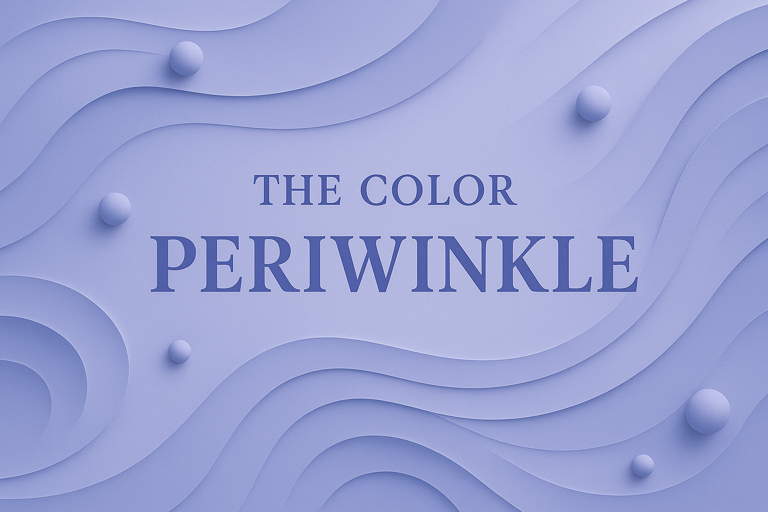
Periwinkle is a delicate blend of blue and purple, which sits between the two on the color wheel. It borrows its name from the periwinkle flower. The most recognized digital version of periwinkle carries the hex code #CCCCFF and RGB values (204, 204, 255). It merges the calm stability of blue with the imagination and spirituality of purple. Periwinkle feels soft and gentle yet expressive and creative.
The History of Periwinkle
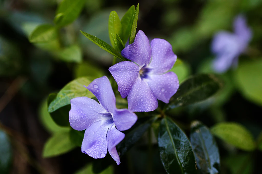
Periwinkle resembles the color of the periwinkle flower and it's name comes from the Old French 'perwinke', which translates to 'shellfish'. It gained popularity in the 1920s and 1930s as a color for clothing and home decor. It has been experiencing a reemergence in fashion, interior deisgn, and branding in modern times due to the pastel nature of the color. It has been used by painters for centuries throughout art history and closely associated with modernist movements such as Art Deco and Bauhaus. Perwinkle can be found in a variety of design styles and periods.
Technical Periwinkle Information
Periwinkle is used design due to its lightness and versatility, making it a popular color. Here are the technical specifications in both digital and print for the color:
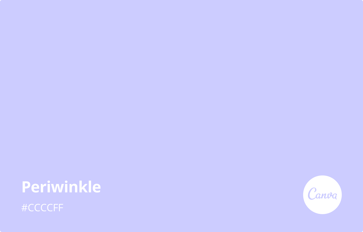
Hex: #CCCCFF (specific color code)
RGB: 204, 204, 255 (digital color definted by Red, Green, Blue)
RGB Percentage: 80%, 80%, 100%
CMYK: 20%, 20%, 0%, 0% (print color defined by Cyan, Magenta, Yellow, Black)
HSL: 240degrees, 100%, 90% (color defined by Hue, Saturation, Lightness)
Web Safe: #CCCCFF
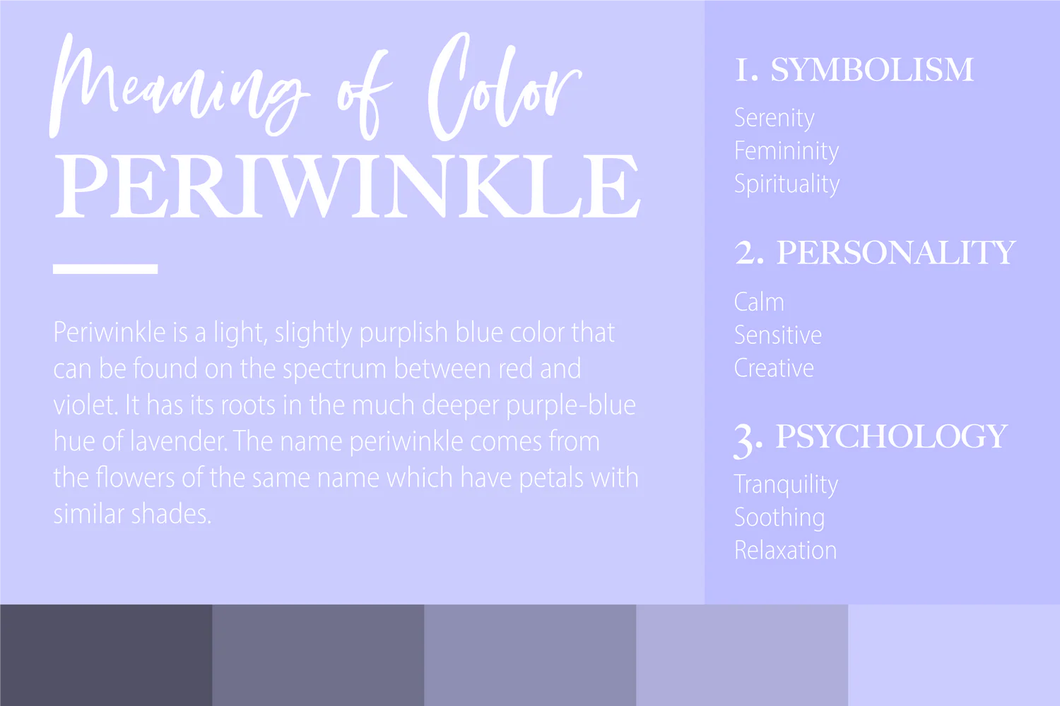
The Symbolism of Periwinkle
Periwinkle carries layered emotional and symbolic meanings and is often associated with:
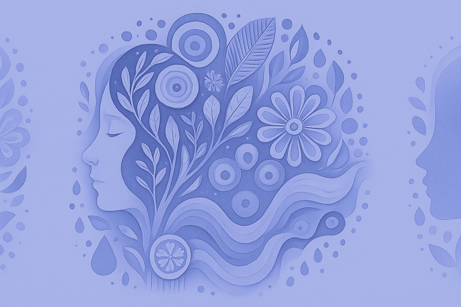
Creativity: Due to its association with imagination, periwinkle is a popular choice for artists and designers. The light hue encourages artists to explore different ideas without feeling tied to a distinct color palette due to the versatility of this color. This is an ideal color for those looking to express their thoughts and feelings through their creativity.
Elegance: The graceful tone of periwinkle conveys a sense of sophistication. Due to the subtle hues, it has a timeless classic feel that never goes out of style. This has made it popular for those looking at fashion options that look classy and don't overpower. This delicate shade invites an atmosphere full of grace and poise.
Empathy: Feelings of sensitivity are promoted by the soothing effects of periwinkle, enhancing feeling of empathy towards others. The tranquil qualities make it popular for those practicing self-care and mindfulness activities like yoga and meditation.
Introspection: Periwinkle is assocaited with introversion and looking inward. Its muted hues can promote deep thought and reflection by providing an atmosphere of solitude by not distracting the observer. The calming effects make it popular for those who prefer their own company by creating a sense of peace.
Intuition: Periwinkle is associated with spiritual and mystical qualities through its unique blend of blue and purple. In some cultires, it has been associated with divine protection and assistance from higher realms. It serves as a reminder that we are never alone when facing life's challenges and connects us to our inner selves.
Periwinkle Color Psychology
Periwinkle does not overwhelm, unlike bold-purple or deep-blue. Instead, it creates emotional openness. It is especially effective in digital spaces, because it is easy on the eyes, while feeling distinctive. Audiences typically connect to periwinkle as:
Creativity & Imagination: The violet undertones stimulate creativity and curiousity. Designers often use periwinkle to create dream-like or whimsical aesthetics. When used in art, it helps express complex emotions without being an overwhelming color and often complements palettes. The lightness of the hue allows room for experimentation with different concepts without feeling restricted due to its vesatility.
Harmony & Balance: It blends cool-blue and warm-purple, periwinkle symbolizes balance between left-brain and right-brain with logic and intuition. It strikes harmony between the mind and spriit, making it a great choice to find equilibrium in our lives.
Nostalgia & Sentimentality: Its pastel softeness often evokes springtime, childhood memories, blossoming frienships, and fantastical magic. Its combination of blue and purple is reminiscent of fond childhood memories, evoking positive emotions from our pasts. It's color can be used in design projects associated with this like photo albums or scrapbooks.
Soothing and Calming: Periwinkle has an incredible calming effect on the mind and emotions. It is described as tranquil and serene and helps to reduce stress and anxiety. By combining two colors known for their cooling properties (blue and purple), it creates a soothing tone that helps one relax physically and mentally.
Spiritual Growth: In spiritual symbolism, periwinkle can represent faith, healing, renewal, and intuitive awareness. Its calming effects promotes openness by encouraging exploration of different paths with a sense of clarity and objectivity. It has been used by many religious practices throughout history, because it represents peace, serenity, and acceptance.
Periwinkle in Branding
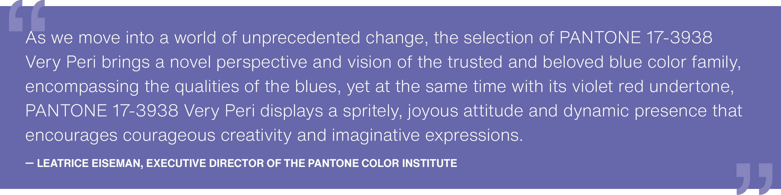
"The Pantone Color of the Year reflects what is taking place in our global culture, expressing what people are looking for that color can hope to answer. " added Laurie Pressman, Vice President of the Pantone Color Institute. "Creating a new color for the first time in the history of our Pantone Color of the Year educational color program reflects the global innovation and transformation taking place. As society continues to recognize color as a critical form of communication, and a way to express and affect ideas and emotions and engage and connect, the complexity of this new red violet infused blue hue highlights the expansive possibilities that lay before us."
In 2022, Pantone introduced PANTONE 17-3938 Very Peri as its Color of the Year. It is a dynamic periwinkle-inspired shade symbolizing transformation, digital innovation, and imaginative courage. This marked the first time Pantone created a brand-new color for its Color of the Year program, highlighting periwinkle's cultural signficance in a rapidly evolving world.
Periwinkle is often used in industries that wany to convey trust and credibility like in healthcare, wellness, and finance. In boutique brands and beauty, it evokes a feeling of luxury and sophisticaiton. Periwinkle also communicates feelings of calm and relaxation, especially in spas and yoga studios. For design studios and tech startups, it provides feelings of creativity and innovation.
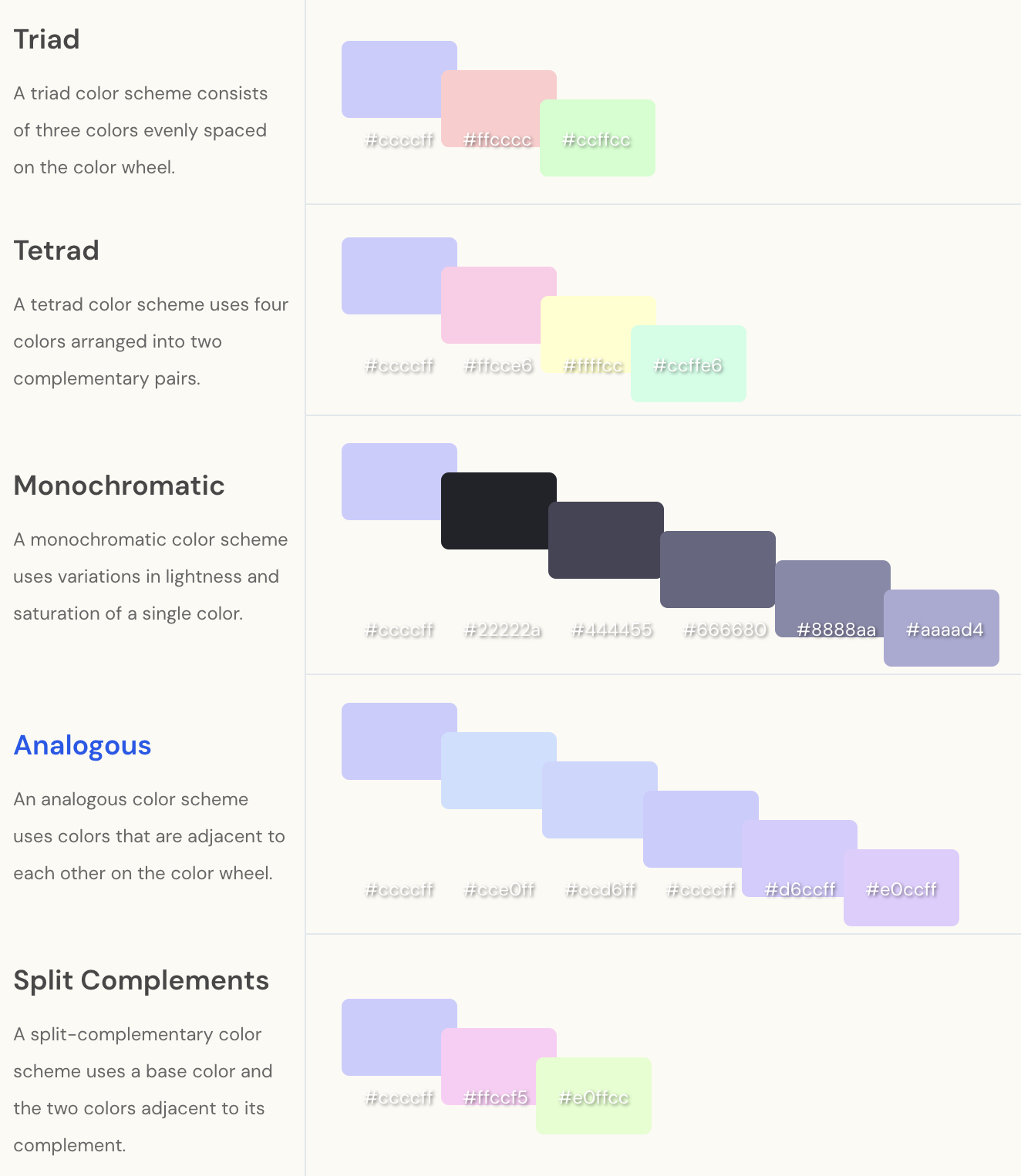
Periwinkle Color Palettes
Periwinkle can be adjusted through tints by adding white or shades by adding black. These variations allow designers to maintain emotional consistency while adjusting intensity. These include: pale periwinkle, soft periwinkle, royal periwinkle, and midnight periwinkle.
Periwinkle is extremely versatile and pairs beautifully with other colors. Periwinkle acts as an anchoring hue, it works well alongside vibrant oranges, greens, and pinks without clashing. It pairs well with other soft colors like soft yellow, mint green, or lavender/lilac. These combinations can add warmth, cheerful contrast, feelings of harmony, and are fresh and spring-like. Gold and periwinkle can produce a luxurious, elegant effect. Neutral colors also pair well with periwinkle like white, cream or gray. These produce clean, airy sophistication, and are a modern balance of aesthetics.
Periwinkle on the Web
Periwinkle is commonly used on the web as it is easy on the eyes. It can be used as a background color to help reduce visual strain. It provides gentle contrast so it is well utilized through call-to-action buttons. As previously mentioned, periwinkle is well utilized through branding for wellness, lifestyle, and creative brands so it has a purpose on businesses' websites as a key branding color. It can also be used as a gender-neutral color, appealing to a universal audience. Its high lightness value makes it especially effective as a contrasting background color to darker typography.
Periwinkle Quotes
Periwinkle Skies: Refers to the beautiful shades of periwinkle seen in the sky during sunrise or sunset.
Periwinkle Power: Used to express the strength, resilience, and determination associated with this color.
In a Periwinkle World: Suggests an idealistic view of life where everything is calm, peaceful, and harmonious.
Periwinkle Paradise: Describes a perfect place characterized by beauty, tranquility, and relaxation.
Periwinkled Out: Describes feeling exhausted or overwhelmed after a long day spent doing something tiring.
A Touch of Periwinkle: Refers to adding a small element of flair as an addition to something.
Peri-wink wink!: A playful phrase as an inside joke based off the color.
The Magic of Periwinkle: Describes the enchanting qualities like joy, peace and serenity in our lives.